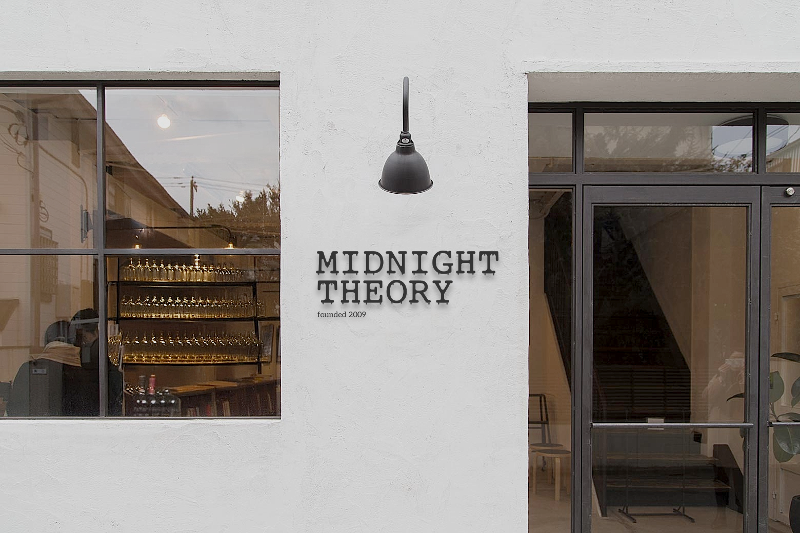
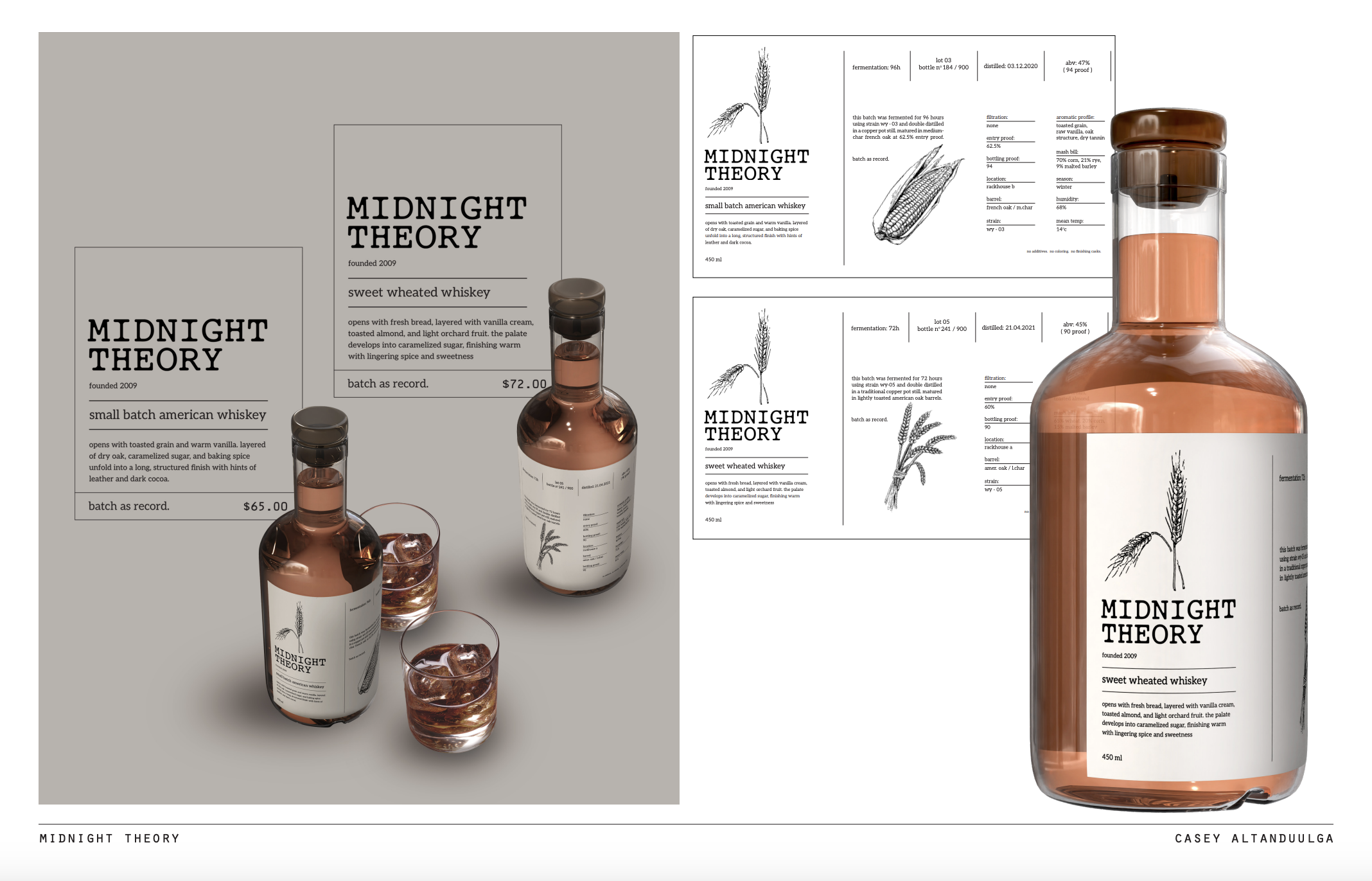
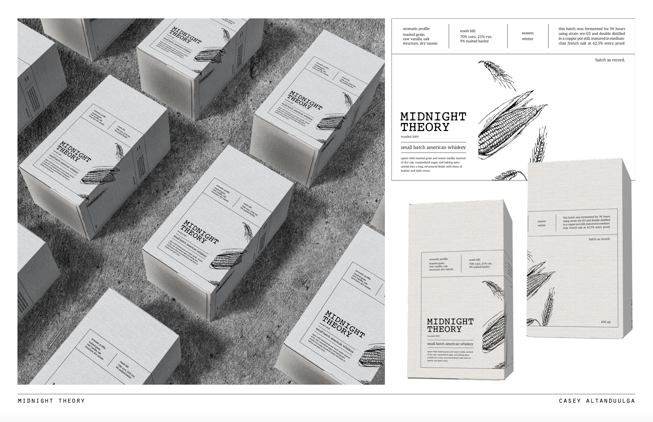
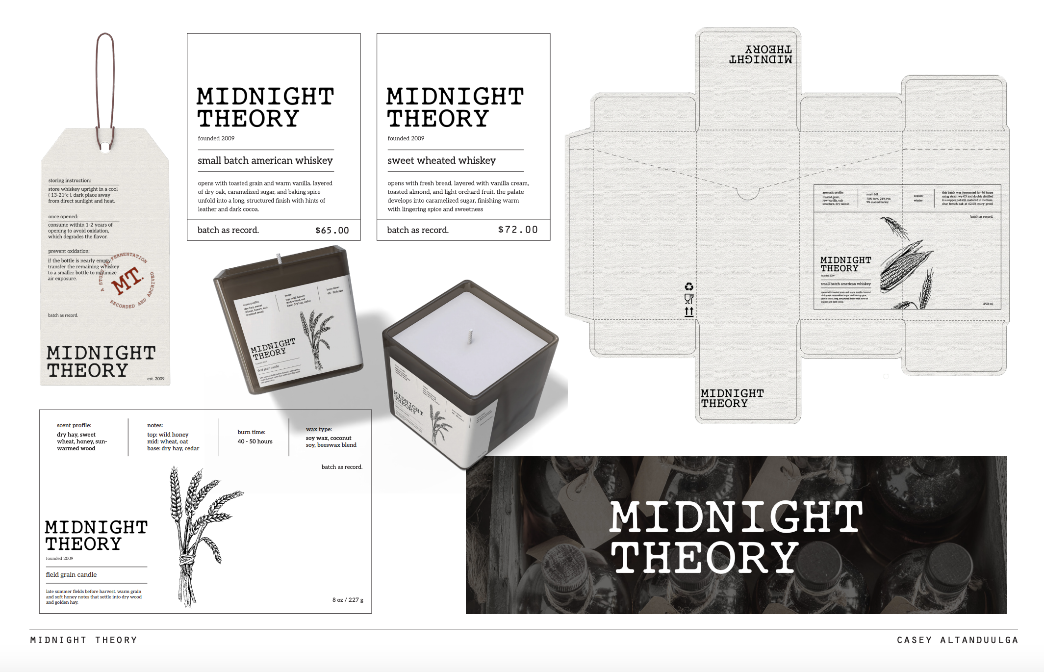
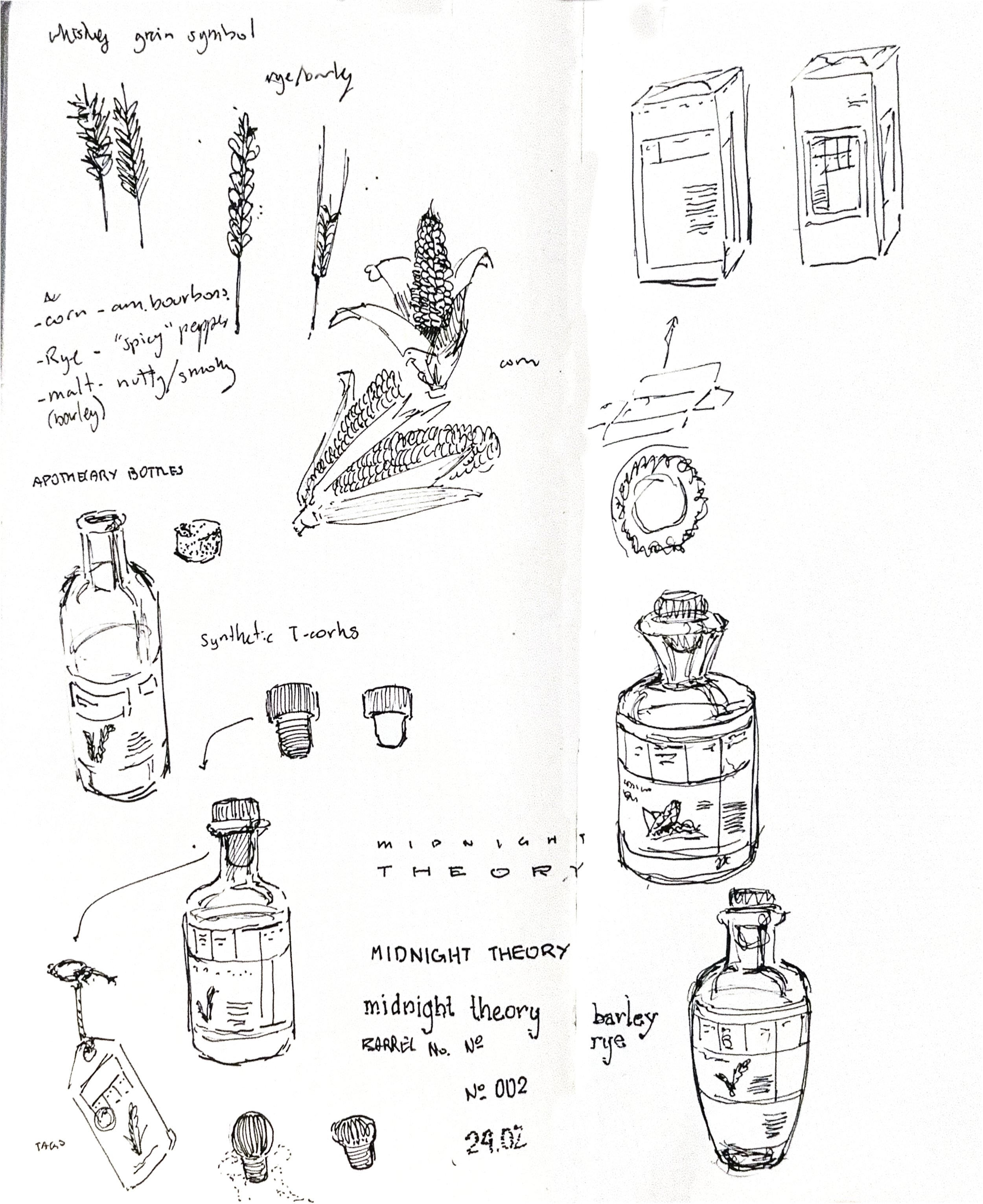
branding · class project
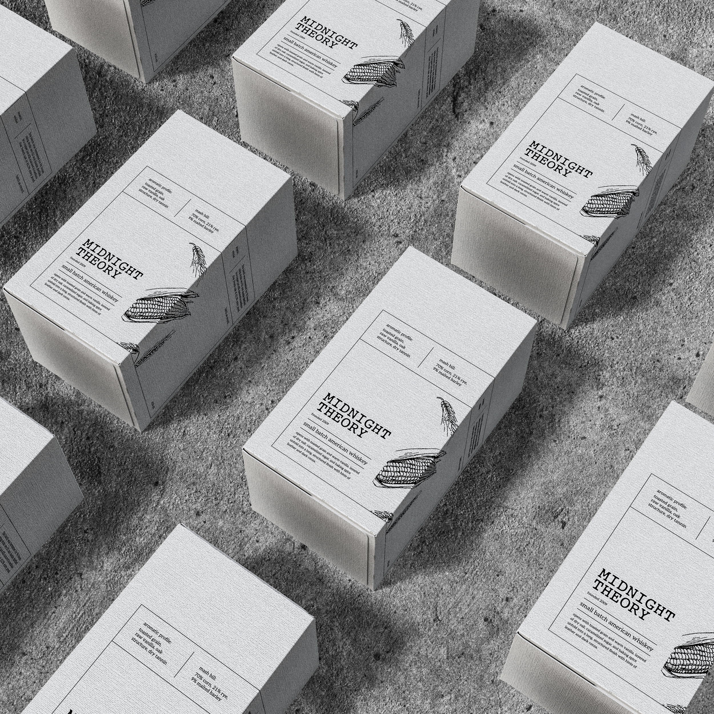
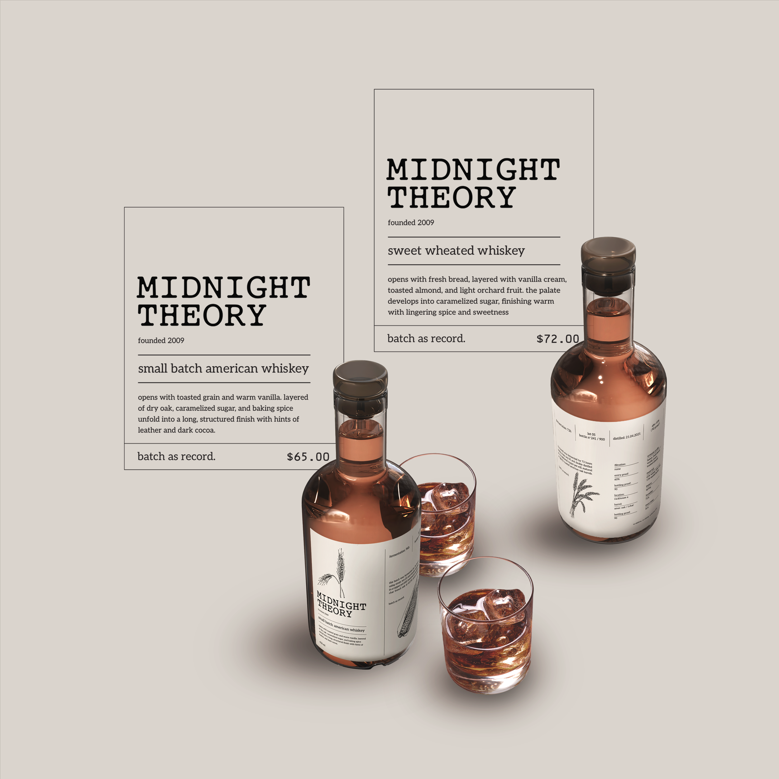
conceptual whiskey brand built around experimentation.  the project explores how branding can reflect the process of a product, every bottle is treated like a documented study.
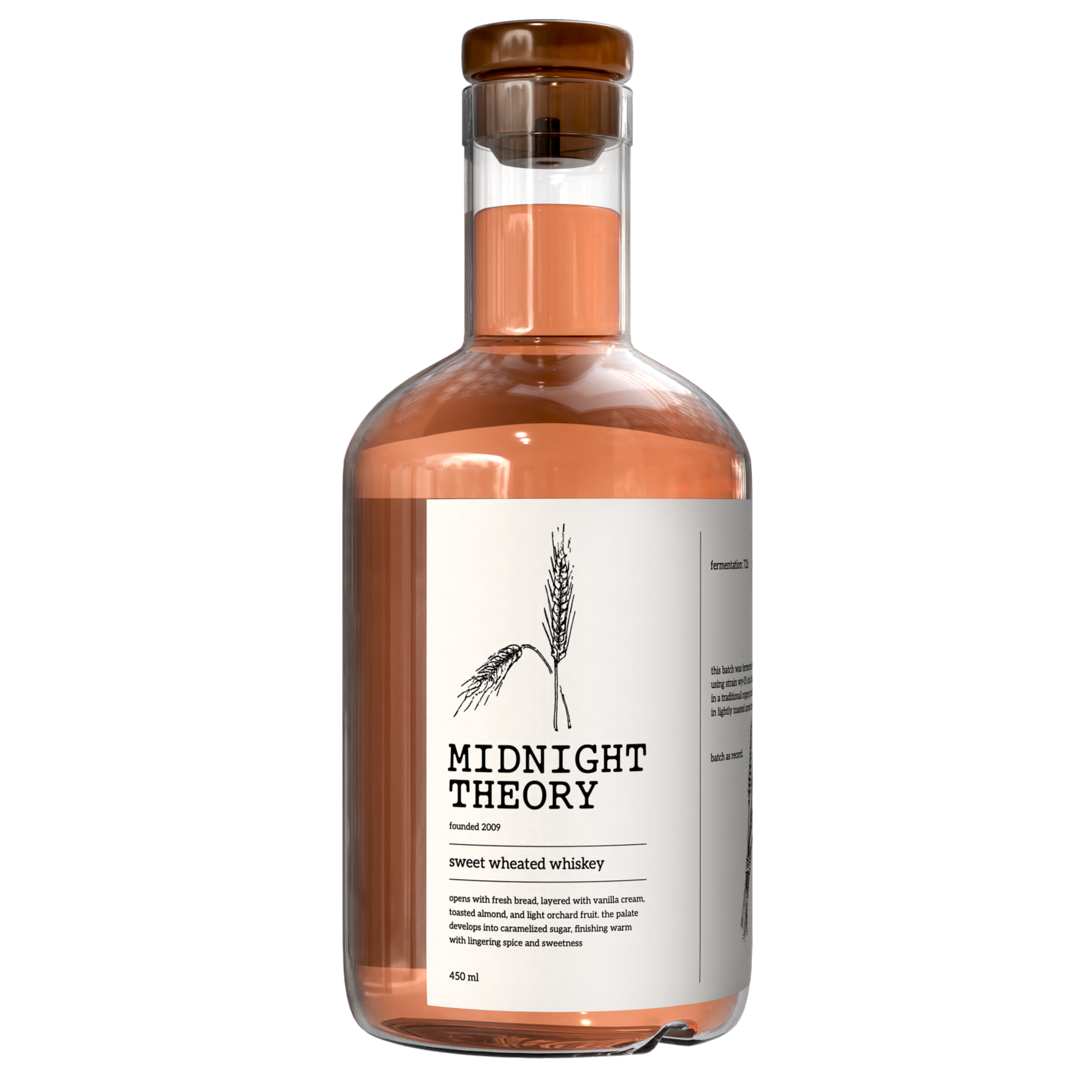
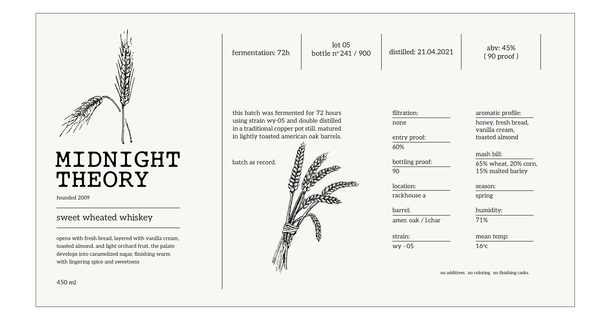
" founded in 2009, Midnight Theory was established as a study in fermentation and distillation. "

the brand prioritizes process and documentation, the visual design reflects the brand’s archival nature. inspired by scientific documentation and lab records, the design emphasizes clarity, structure, and process.
Midnight Theory logo system
core design elements: highlighting process details such as fermentation time, mash bill, and environmental conditions.
a single typeface and font is used across all applications to support consistency and control.
this limitation mirrors the brand’s philosophy—removing unnecessary variation to focus on the product and process.

each label is designed as a record sheet, documenting the specifics of each batch.
hand-drawn grain illustrations portray raw ingredients to contrast with the structured, grid-based layouts.
the balance between organic imagery and rigid typography reflects the relationship between natural processes and controlled experimentation.
by documenting each bottle, Midnight Theory creates a system where the specifics are highlighted and is part of an archive.
Next
Next

niceworkshop interview feature